“Every act of creation is first an act of destruction.”
-Pablo Picasso

When it comes to web design, there really is no right or wrong answer because each site has unique specific needs designated to the site’s owner. There are however some universal tips and tricks that will benefit both the site owner, and the site user:
The Do’s:
- Make sure to keep file sizes as small as possible. Doing this allows for site and all its content to download as quickly as possible (otherwise the site users might grow impatient and leave).
- Put the most critical information about who/what you are in the first page/homepage. This allows your site users to quickly find your information instead of having to navigate to different pages in order to look for it.
- Have good and clear structure of your information. Using similar and easy-to-read fonts and navigation helps users navigate through your site more effectively.
- Keep you content simple. Too wordy pages or long chunks of information tend to get overlooked, compared to those that have smaller paragraphs or a more spaced out way of reading the information.
- Take the time to make sure that all graphics are not pixelated and don’t have a halo effect around them. Provide an alternative text for every graphic to allow descriptions in case the visual isn’t available.
The Don’ts:
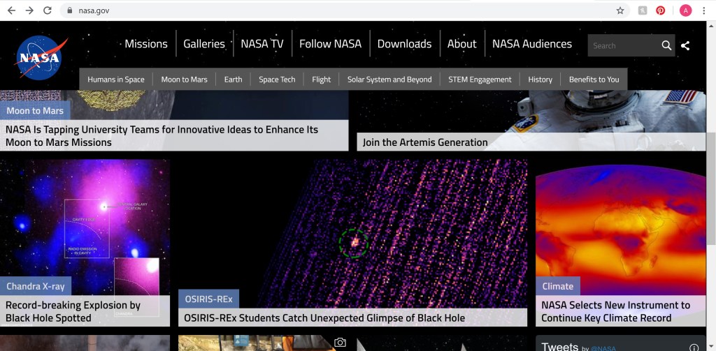
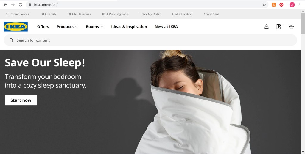
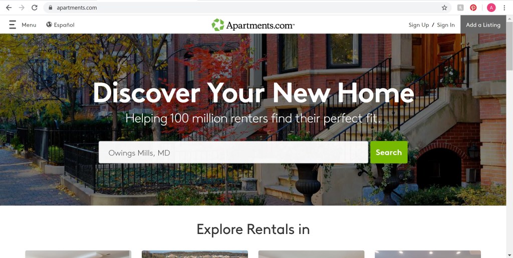
- Don’t overdo it with images or graphics (as seen above). Having too many visuals may distract from the main point of your website, especially if you are not retail or commerce.
- Don’t use the same type for everything, such as all caps, or italicizes, or bold. Only the very important information should be emphasized, otherwise people may not know the meaning of your message.
- Never use more than a few color or wild background patterns and colors. Doing so can distract from the information and even make it hard to read.
- Make sure that no images or text look like links. People may try to click on what looks like links and become frustrated when a new tab does not appear.
- Avoid centering everything on the page, and mixed alignments. Doing so makes it harder to organize and find content later on. The reader or user will also become annoyed having to jump all over the screen trying to look for the information.
At the end of the day, each site should be unique and stand out. A website should be the representation of the site owner’s style, perspective, and message. However, these tips and tricks will help the intended purpose of the website to come across more quickly, effectively, and efficiently.
